Algorithmic color design
by Jack Qiao
When we talk about machine learning and color, the first thing that comes to mind is probably black-and-white photo colorization and neural style transfer.
Although these pixel-level techniques work for photos, they're not great for graphical styles of art:
1. Graphic design is highly multi-modal (graphical images are often deliberately dissimilar from existing examples)
2. Graphic design is typically abstractive, lacking high frequency information for style transfer.
3. We want to avoid biasing toward conventional or cliche color associations like sky->blue, grass->green etc.
The Color Graph
a better color palette
Broadly speaking, graphical art can be decomposed into a few elements, let's call them value, color, and style

Traditionally the color component has been represented by a color palette, but a palette doesn't quite capture how colors are used in the image - the two major things it lacks are scale and adjacency. IE. how much of each color to use, and which color should go next to another.
Without this contextual information, the same palette applied in different ways can look dramatically different.

Value
overall form and contrast

Color
hue, saturation and lightness

Style
textures, gradients, effects
The black/blue dress illusion is a great demonstration of the importance of color adjacency. This effect works because we perceive the dress colors differently based on the surrounding colors.


Rather than a flat list of colors, a more natural way to represent color composition is with an undirected, weighted graph.
In this graph edge weights correspond to adjacency (it's also possible to account for scale but in practice the two are highly correlated). More specifically, the weights represent how much the node pair contributes to the overall contrast of the image.
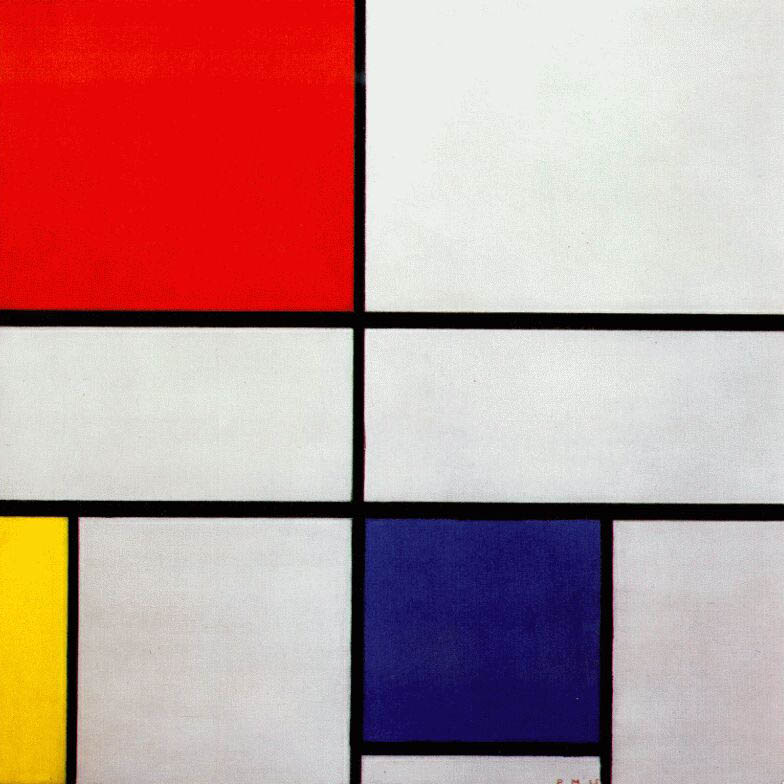
Pier Mondrian
Composition C (No.III) with Red, Yellow and Blue

In this Mondrian piece the black node is highly connected to all others. Even though it's not the largest by area, we can assume that it's more important to the color composition of the piece.
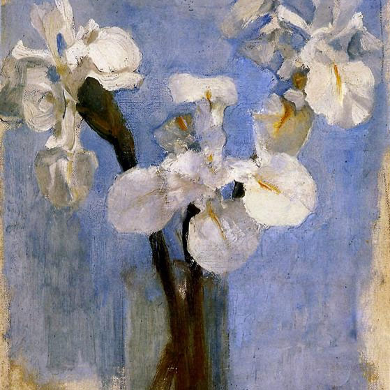
Pier Mondrian
Flowers Sun

Without hard color boundaries, the color graph of paintings are more linear, with a gradual transition from dark to light.

Applications
using the color graph
We can make the observation that graphical images tend to use a limited palette, making for fairly trivial graphs.
By limiting the palette to a fixed size (we use 16) we can easily compare color graphs by their normalized graph Laplacian.
Some possible uses for this type of data:
- clustering stylistically-similar images by color graph similarity
- transferring the color design of one image to another in a coherent way
- feeding the vector representation into a conditional GAN to create plausible colorizations
- instead of a ML approach, we could also start from first principles and view colorization as a constraint optimization problem

Future work
Manipulating colors with a graph structure works best with images that have obvious color adjacencies. There are a few unresolved issues with this method:
1. dealing with photographic designs, gradients and textures
2. accounting for the importance of elements on a compositional level
Fundamentally, our visual system is trained to perceive the world through boundaries and contrast. To expand this concept it should be possible to use semantic segmentation to find relevant visual groupings and boundaries.
Subscribe
Want to see what we're working on next? Subscribe to our mailing list