
Learning
For logo design
Summary: Brandmark uses deep learning tools to generate logos composed of an icon, typography and color scheme. The specific technologies used are conv nets, word embeddings and GAN.
Try the logo generator or get more info on our homepage
Logo design is a creative field that's defined by constraints. A good logo is not only illustrative of the brand but simple enough to be legible from afar. It must also be unique enough to not be confused with the myriad of symbols and icons that surround us.
Logos are essentially abstract illustrations, but clearly not all illustrations make for good logos. In order to create logos systematically we need some notion of what makes a logo good in a visual sense.


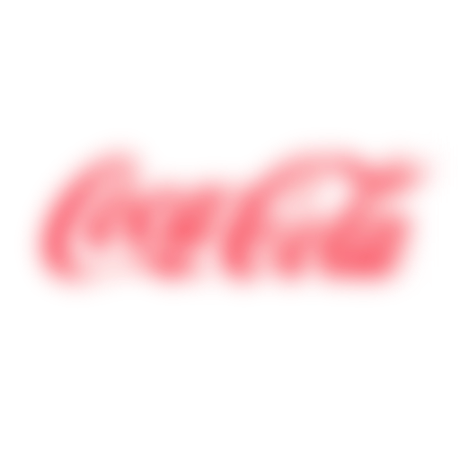
A key property of good logos is legibility. Notice how these iconic brands are immediately obvious despite being blurred.


Good logos are also unique. Common symbols and shapes don't make for good logos despite being very legible, as they are not brandable.
Using the noun project as our repository of icons we have a bit less than a million illustrations to sort through, but fortunately this problem is highly amenable to deep learning techniques.
For each icon we compute a legibility score with a convolutional net, as well as a neural embedding from the final layers of that conv net. The embedding can then be used to determine the visual similarity between icons.


A large number of icons with high similarity indicates that these icons may not be very unique as a group. Whereas traditional computer vision approaches would be sensitive to line styles, fills and other markers, the neural net approach can group these icons despite some of them being very visually dissimilar.
Using the derived legibility score and uniqueness score we can find illustrations that are both legible and stand out from common shapes.
Typography
I previously discussed using font vectors to discover relationships between fonts. In the context of logo design we want to do something similar - pair icons with fonts.
Unfortunately this problem is a bit more difficult, as there aren't any hard rules we can follow and the aesthetics of typography is heavily subject to taste.
However we can increase our hit rate with some rough heuristics:
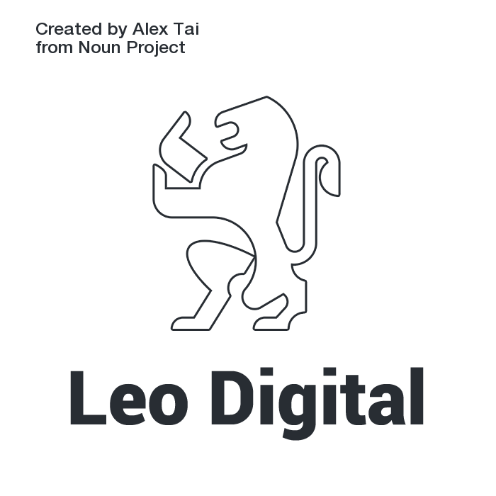 Thin icons with a heavy font don't usually look very good
 Bold icons with a thin font also looks rather unbalanced
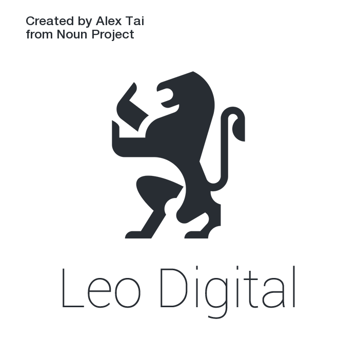
 Matching weights tend to look more intentional
We can match up fonts and icons with similar visual features using their neural embedding, which generally produce more cohesive logos.
Color
Color can be used communicate emotion and make a brand more memorable. Of the top global brands, most have relatively saturated colors as a core part of the brand. (Also see the notable exceptions where the lack of color is used as a differentiator)
Color should also be used in a thematically appropriate way. Notice how this icon takes on different emotional dimensions depending on the surrounding context:
Dark, saturated colors
Light, saturated colors

Dark, desaturated colors
I've previously discussed using GANs to create novel color combinations, but in the context of branding we would like to have something more guided. Here we take the approach of pre-generating a large number of color schemes, then sorting them by lightness and vibrance. With some word association we can ensure that the results are thematically appropriate.
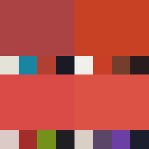
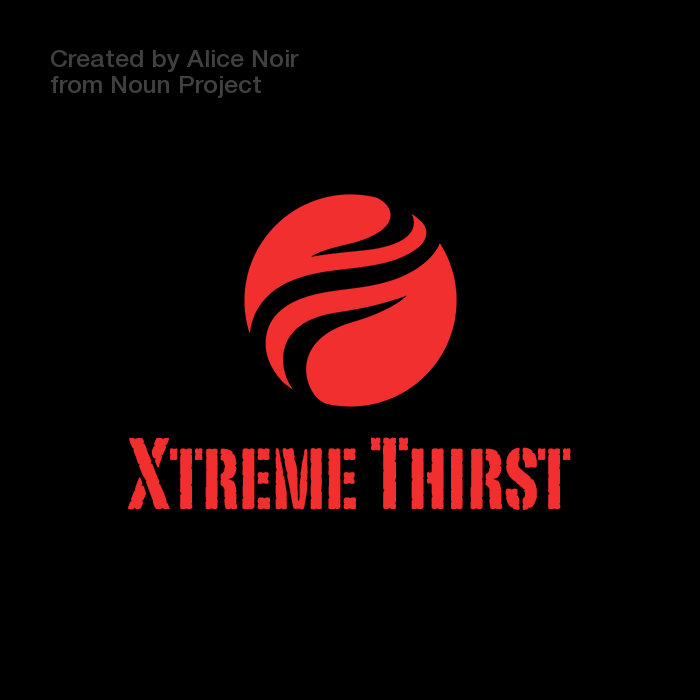
"Extreme", "Fiery", "Powerful"
More emotive words generate brighter colors
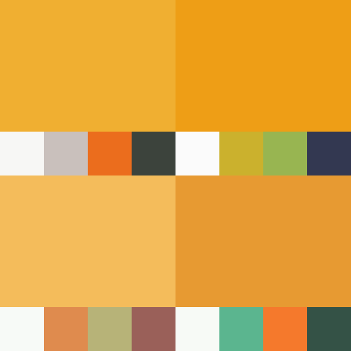
"Fun", "Children", "Playful"
Words with levity generate lighter colors
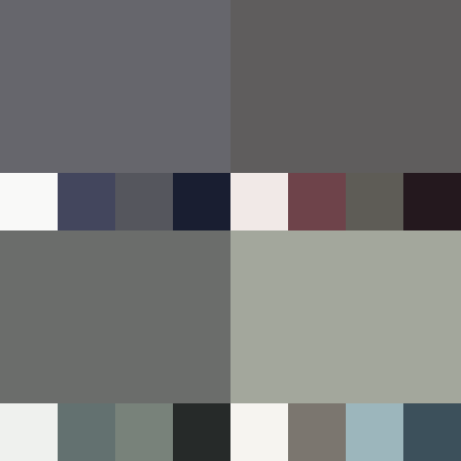
"Solemn", "Grave", "Government"
Serious, un-emotional words generate more desaturated shades
We use word vectors to determine the appropriate primary hue, lightness and vibrance of the color scheme generator. Word vectors capture the context of their corresponding word. They're often inaccurate for extracting actual semantics of language (for example, you can't use them to find antonyms), but they do work well for identifying an overall tonal direction.
Ultimately logo design is a very subjective field where nuance and attention to detail is important.
Convolutional neural nets probably won't replace designers in the near future, but does open the door to new tools that can democratize the design process and make it a lot more accessible to everyone.
author's note: the app has been updated since the original article. You can still try the older app here